Staying in the loop when it comes to the web design trends for 2021 is beneficial for every professional web designer.
Fast-growing digital technology has been slowed down by the global pandemic. It did not stop – it just slowed down. This means that some web design trends still had their chance to shine or bit outshined.
Each year web design trends promise us different features, approaches, and styles that shape the general looks of the world wide web. But how are 2021 are trends going to be affected by everything that’s going on in both digital and real-world? Will there be some innovative radical trends or are the web designers keeping it safe? How predictable can top web design trends for 2021 actually be, especially after such an unpredictable year?
Wait no more to check Addria's perspective on this topic! Here are Top 8 Web Design Trends for 2021:
Dark Mode
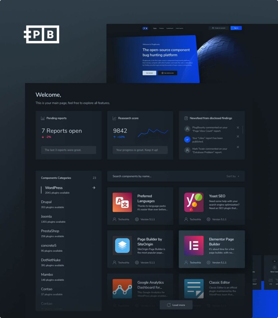
It wasn’t hard to notice the popularity growth of dark mode amongst relevant mobile applications. Instagram has got one, and Facebook launched one recently. There’s no doubt that the dark mode style is going to spread on web-sites soon enough. But what makes dark mode so attractive?

One of the reasons is most definitely reduced eye strain. People are spending more and more time on screens. This is a rather natural example of how health-concerns help shape a design trend.
Besides its practicality, dark mode is also aesthetically pleasing. Having a dominant black (or other dark color shades) as a base combined with vivid colors creates an ultra-modern and futuristic look for your website.
3D Gradients
Gradients have been around for quite a while in the world of web design. But, the way they were being used has been changing from time to time. Gradients are great for overlaying images to create eye-catching and striking backgrounds.
Gradients play with the transition of different usually highly saturated colors. But what if it's three-dimensional? This can make the colors feel as if they are popping right out of the screen.
3D effect is easily accomplished through quality shading and shadows. This combination of colorful abstraction and realism is for sure not going to be unnoticed in the world of web design.
3D Content
Whether it’s a cutout from a 2D photo, a 3D renderer, or a fully interactable 3D object, there’s no doubt that realism is once more getting a boost in popularity. And it’s really not hard to see why. On websites, 3D objects no only look amazing and perfectly stand out with well balanced simplistic background, but they are also rather practical!
They are especially practical in the world of e-commerce. It’s only a question of when will fully functional 3D models replace the classical thumbnail zoom-in images. Some online shops already let their customers view the product in 3D and rotate it through 360 degrees. An example of this is Apple’s AirPods Pro online presentation.
This immersive 3D experience is undoubtedly going to make online shopping more fun and practical experience.
Mobile Design (simplicity)
Did you know that mobile searches overtook desktop searches back in 2015? And Google has even been ranking mobile-friendly websites more favorable since 2018. It’s more than clear that the design of a website must be mobile-friendly in order to be as practical as possible.
This is an example of how screen size can affect web design. Bigger elements and text, different grids, and the hierarchy of importance all must be well combined with the outstanding and unique aesthetic of a website. Simple and practical UI/UX, that is easy to navigate through but also looks pretty is an important web design trend for 2021.
Data Visualisation
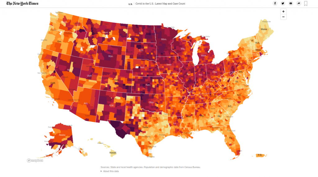
It not surprising that COVID-19 is one of the most searched topics on the internet for 2020. People wanted statistics on a national or international basis, and they wanted it quickly. No one would have thought that there would be such a demand for scientific data visualization in 2020.
After all, a picture is worth a thousand words. Data visualization on the website is not only practical, but it looks nice, is memorable, and fun. Especially if you add some interactive effects like mouse-hovering for more info.
As an example, New York Times did a pretty good job when it came to the spread of the pandemic visualization. It’s much more practical to just refresh a webpage and see the difference yourself from the data visualization, then to just read the plain text as an update. Another example of good data visualization is the way Google visualized the 2020 US elections statistics.

White Space
The white spaces give the website’s content room to breathe. It does not necessarily need to be white, it only means that the area is empty. Trying to put as much information as possible can be aggressive and put off customers. The white place is not only relaxing for viewers, but it also makes the content stand out better and it improves readability.
With so many websites and information sources that pop up each day, people want smooth and quick to find information. This is just what white spaces allow in web design. So don’t be afraid of the empty area!
Minimalistic Realism (Neumorphism)
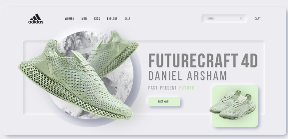
We already talked about the practicality of minimalism and the beauty of realism. Paradoxically, these two actually work very well combined with each other.
This is where Neumorphismtakes the lead role. Neumorphism is presented through 3D renderers overlaid with flat colors. It’s like a combination of flat design and 3D imagery.

Abstract Composition (Asymmetric Layouts)
Combining primitive shapes into a complex yet aesthetically pleasing visual imagery is something that can easily stand out online. These visual compositions exude freedom and are a pretty good way to make your website stand out. Something not so standard yet still beautiful is easy to remember. Abstract compositions also make the website feel more alive and expressive.
Asymmetric element layouts are also a surprisingly good way for your website to stand out. Elements on websites were being placed on grids for years. Asymmetry is an opportunity to be less traditional and embrace individuality and fun. But, of course, this has to be done carefully with taste in order for the website to still be practical. Asymmetry and abstract grids are great for changes in focus amongst people visiting a website. This is great for highlighting one object from the rest.
Conclusion
Web designers will for 2021 have to embrace different trends, imposed by the current situation in the world. Even though almost everything being slowed down due to COVID-19, it's important to give our best in order to catch up with the top 8 web design trends for 2021.
If you are looking for a stable web development company that is surely going to deliver high quality, functional, and on-trend websites, Addria is here for you! Our contact page is just a click away! What are you waiting for? Send us a message and let us know about your idea.


